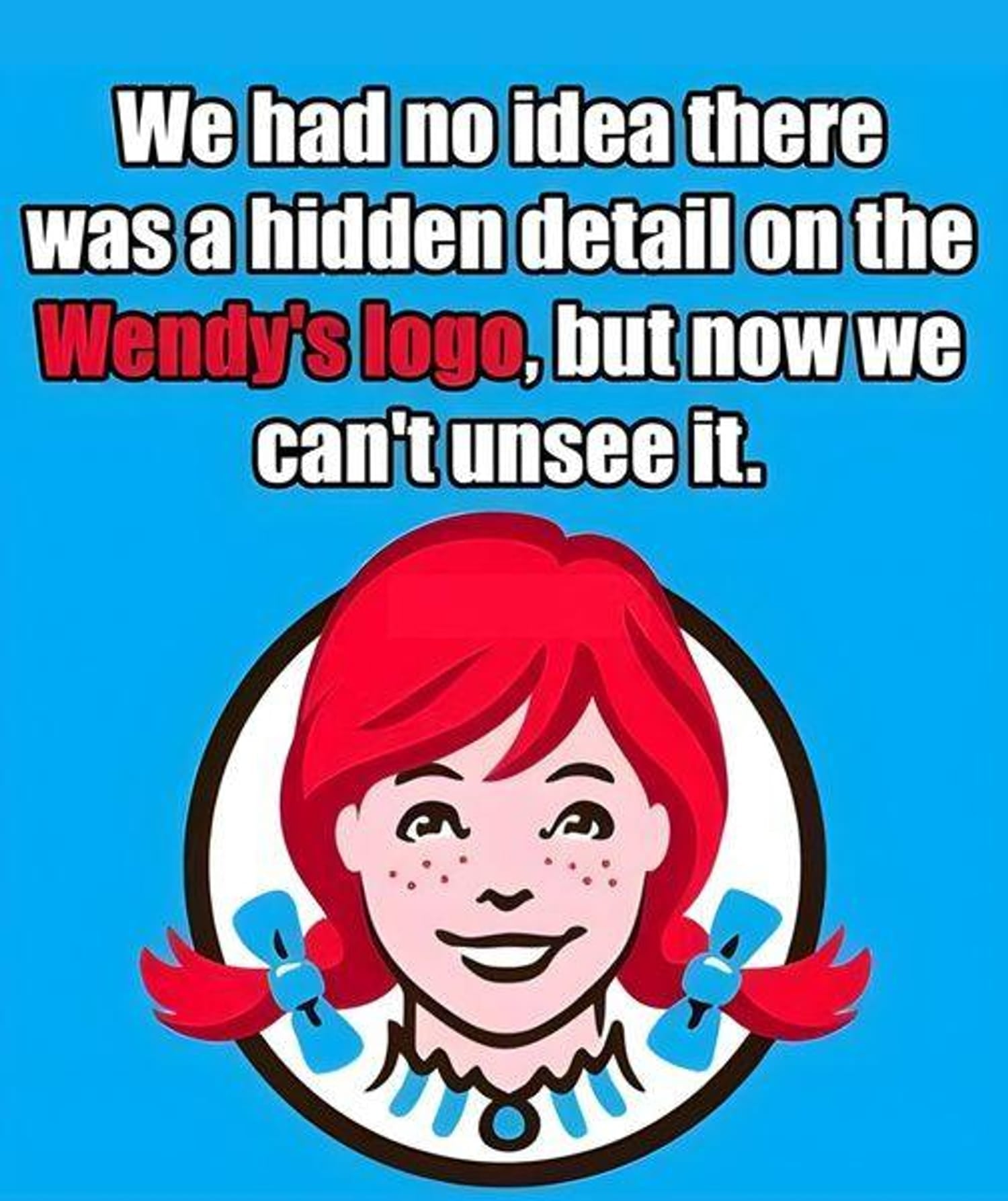
At first glance, the Wendy’s logo appears simple and almost nostalgic. A smiling red-haired girl with freckles, neatly tied pigtails, and a vintage-style collar looks back at customers with a sense of warmth that is uncommon in fast-food branding. Unlike many corporate logos that try to grab attention aggressively, this one feels softer and more familiar. It gives the impression of comfort—something closer to a home-style meal or a place where people gather casually. That tone was not accidental. From the very beginning, the brand aimed to represent quality, care, and a more personal touch than many of its competitors.
Over time, however, people began noticing a small detail that changed the way they looked at the logo. It wasn’t obvious immediately—you had to look closely, especially at the ruffled collar beneath the girl’s chin. Once people spotted it, though, it became difficult to ignore. The folds and shadows in the collar seemed to form the word “MOM.”
That tiny observation quickly turned into something much bigger. What had once been a straightforward brand image suddenly felt layered with hidden meaning. Fans no longer saw only a logo; they believed they had discovered a message. And not just any message, but one tied to emotion, family, and trust. The word “MOM” carries powerful associations—care, warmth, and home. For a fast-food brand, those ideas are incredibly meaningful.
People soon began connecting the theory to the company’s origin story. Wendy’s was founded by Dave Thomas, who named the brand after his daughter, Melinda “Wendy” Thomas. Because of that family connection, the idea of a subtle tribute to motherhood hidden within the design felt believable. The story almost seemed too perfect: a company built around family values quietly embedding the word “MOM” into its logo as a reminder of home-style care.
Once the idea appeared online, social media helped it spread quickly. People shared close-up images of the logo, highlighting the collar and tracing the letters. Others joined the discussion with their own interpretations, reinforcing the idea that this detail could not simply be coincidence. It became one of those internet discoveries that felt like uncovering a hidden secret hiding in plain sight.
As the theory circulated, it resonated with many people. Fast food is often associated with speed and convenience, sometimes even with a lack of authenticity. But this interpretation changed that perception. It suggested that behind the brand there might be a human story—a reminder of family and home embedded subtly within the design.
Eventually, the company addressed the theory directly. Wendy’s clarified that the “MOM” detail was not intentional. According to the brand, the collar design was simply a stylistic illustration and was never meant to spell anything.
Normally, a clarification like that would end the conversation. A rumor would be debunked and people would move on. But in this case, something different happened. The denial didn’t completely erase the idea—in some ways, it made the discussion even stronger.
By the time the company responded, the theory had already taken on a life of its own. People had shared it widely, discussed it with friends, and integrated it into how they viewed the brand. The official explanation simply added another perspective to the story rather than closing it.
Situations like this show how meaning works once a design enters the public world. A logo no longer belongs only to its creators. It becomes part of culture, where people interpret it through their own emotions and experiences. The designer’s intention is only one piece of the puzzle—what audiences believe and feel can matter just as much.
In this case, the “MOM” interpretation resonated because it connected to something universal. It wasn’t just about letters hidden in a collar; it was about the emotions those letters represented. People associated the image with comfort, care, and familiarity, and that connection stuck.
Stories like this also highlight how branding works. Companies spend enormous resources trying to create emotional connections with customers. They want people to associate their products with positive feelings and meaningful experiences. With the Wendy’s logo, that connection happened almost organically, without a deliberate marketing push.
Even after the company clarified the design, many people chose to keep the original interpretation. Not because they ignored the explanation, but because the idea itself felt meaningful. It made the brand seem more human and relatable.
There is also a quiet message in that choice. It shows that consumers are not just passive observers of branding—they actively interpret and sometimes reshape the meaning of what they see. In doing so, they create a shared cultural story that exists alongside the official one.
The Wendy’s logo itself hasn’t changed. The freckled face and vintage collar remain exactly the same. What has changed is how people view it. For some, it remains a simple and friendly symbol. For others, it carries that extra layer of meaning, whether intentional or not.
And that is what makes the situation fascinating. It is not really about whether the collar spells “MOM.” It is about how easily people can find meaning in small visual details—and how those meanings can spread, evolve, and remain long after the original explanation.
In the end, the logo achieved something many brands hope for. It made people pause, look more closely, and start a conversation. Whether the hidden message is real or imagined no longer matters as much.
Because once people see it—and once they feel that connection—it becomes real in its own way.