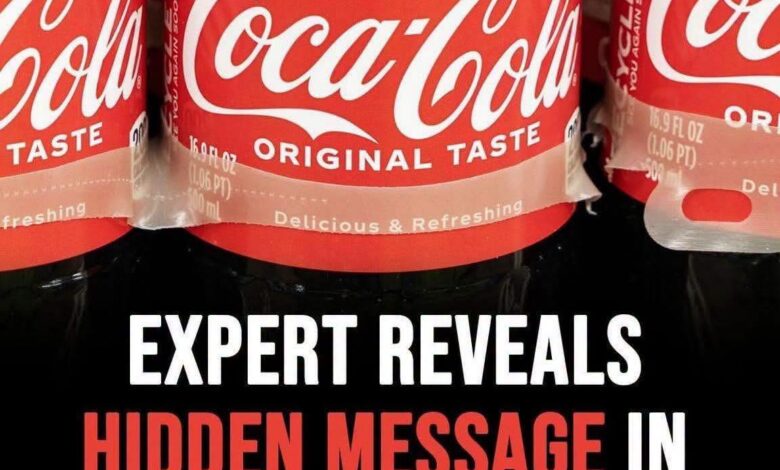
For over a century, the world has been obsessed with the refreshing taste of Coca-Cola, but billions of people have been staring at its iconic logo every single day without ever noticing a haunting, hidden detail hiding in plain sight. It isn’t just a collection of flowing, elegant letters; it’s a masterclass in visual deception that has been playing with your subconscious for decades. If you look closely at the second letter “C,” you will see something that transforms the entire brand identity from a simple corporate script into a grinning, wide-mouthed smile. Once you see it, you can never unsee it.
The familiar red-and-white script has long been the gold standard of American branding. It is a symbol of summer, celebration, and nostalgia. However, design enthusiasts and casual observers online have recently ignited a massive debate after pointing out that the tail of the second “C” in “Coca-Cola” carries a distinct, upward curvature. When viewed through the lens of modern graphic design, this shape doesn’t look like a standard piece of calligraphy; it bears a striking, uncanny resemblance to a subtle, human grin. Suddenly, the logo feels less like a corporate trademark and more like a cheerful face looking back at you.
For many, this revelation is a game-changer. It shifts the entire perception of the wordmark from a static piece of text to an expressive, anthropomorphic icon. The way the upper curve of the letter stretches outward before dipping back down creates a geometry that mirrors the natural anatomy of a smile. Some have compared the phenomenon to the psychological concept of pareidolia—the human tendency to perceive meaningful images, particularly faces, in random patterns or shapes. Just as we see shapes in clouds or constellations in the stars, we are now projecting a human emotion onto one of the most recognizable logos in history. Once that cognitive connection is made, it becomes virtually impossible to look at a soda can the same way again.
To understand how this happened, we have to look back at the origins of the design. The logo was not created by a graphic design firm in a high-rise office using sophisticated software. It was crafted in the 1880s by Frank Mason Robinson, the bookkeeper for the company’s founder, John Pemberton. Robinson chose a script style known as Spencerian handwriting, which was the standard, elegant cursive used in American business and personal correspondence during the late 19th century. Its flowing loops, ornate flourishes, and varying line weights were characteristic of a refined, calligraphic era—not a modern era of subliminal marketing.
There is absolutely no historical evidence in the company’s extensive archives to suggest that Robinson intentionally embedded a facial expression into the brand identity. He was focused on elegance, readability, and establishing a professional aesthetic for a new product. The “smile” is clearly a byproduct of the graceful, sweeping strokes of the Spencerian style. It is a serendipitous collision between 19th-century penmanship and the evolving way modern consumers interact with visual information.
Yet, even if the smile was unintended, its presence feels eerily intentional. Coca-Cola has spent over a hundred years marketing itself under the umbrella of “happiness,” “enjoyment,” and “sharing a Coke.” Whether or not the logo was designed to smile, the fact that it does—or at least appears to—aligns perfectly with the brand’s multi-billion dollar mission statement. Human beings are hardwired to seek out emotional cues, and when we see a “smile” attached to a product that promises joy, our brains are reinforced to trust the brand on a deeper, more primitive level. It is a testament to the power of classic design that a script created over 140 years ago still feels relevant, inviting, and surprisingly expressive to a modern audience.
This viral observation serves as a fascinating reminder that design is a living, breathing thing. A logo does not exist in a vacuum; its meaning is constantly being negotiated and renegotiated by the people who consume it. What was once just a standard calligraphic choice in 1886 has been transformed by the eyes of the 21st century into something entirely new. It highlights how much we bring of ourselves to the things we look at. Our own expectations, our own subconscious biases, and our own need to find meaning in the mundane turn every logo, sign, and symbol into a Rorschach test of sorts.
Whether you believe it’s a brilliant hidden marketing ploy or just a happy accident of 19th-century penmanship, the “C” smile is now a part of the brand’s enduring legacy. It proves that the most powerful designs are the ones that can evolve alongside their audiences. We may never know if Frank Mason Robinson knew he was drawing a grin, but he certainly succeeded in creating a mark that has brought a smile to the faces of consumers for generations. Today, every time you crack open a cold bottle, you aren’t just drinking a beverage; you’re engaging with a piece of visual history that is constantly revealing new secrets, one curve at a time. It is a small, subtle detail that reminds us to look closer at the world around us, because even the most common things often hold hidden stories waiting to be discovered.